Spanish DIY enthusiasts were using different platforms for different needs with no cohesive home base. Bricoteca had the physical infrastructure, but no digital platform to serve this fragmented audience. The challenge: design a unified platform that becomes the definitive destination for Spain's maker community.
Client
Henkel
role
Lead Product Designer
timeline
3 months | 2024
PLATFORM
Web: desktop & mobile
team
1 PM, 1 UX Designer, 2 Designers, External Dev Team
The problem
DIY and craft enthusiasts in Spain were fragmented across Pinterest (inspiration), Facebook groups (community), YouTube (learning), and forums (questions) with no cohesive platform bringing these experiences together. Our competitive analysis revealed the core tension:
"I follow five different Facebook groups just to keep up with DIY projects. I wish there was one place where I could find everything." Research insight from existing Bricoteca customer
The platform needed to unify discovery, learning, creation, and community while serving everyone from complete beginners to experienced makers.
The opportunity
If successful, Bricoteca would become Spain's definitive DIY & Craft digital community, establishing Henkel as the authority in the space while:
Building brand awareness beyond physical centers
Creating user engagement and loyalty
Connecting makers across Spain
Integrating digital experience with physical workshops
No existing Spanish platform offered this comprehensive ecosystem, creating a clear market opportunity.
Design goal
Design a community platform that unifies discovery, learning, creation, and connection for DIY enthusiasts across paper crafting, kids' activities, and home repair, all within Bricoteca's approachable brand experience.
Key design questions
How could we create a unified experience that serves both complete beginners and experienced makers?
What would make users contribute their own projects rather than just consuming content?
How could we integrate physical workshops seamlessly while organizing thousands of projects across multiple craft disciplines?

My role & approach
As Lead Product Designer, I directed the complete design process from strategy through execution:
Strategic Foundation
Conducted competitive analysis and defined product strategy
Defined product strategy and feature prioritization
Established information architecture for scalable platform
Design Leadership
Led design team (1 UX Designer, 2 Product Designers) through ideation and execution
Collaborated with PM and development team on technical feasibility
Created high-fidelity prototypes validated with stakeholders
Execution
Designed complete UI system across desktop and mobile
Established design patterns and component library
Created comprehensive documentation for development
Research & discovery
Research constraints & approach
We designed a sprint-based research structure to generate high-confidence insights quickly:
Competitive analysis (5 platforms)
Bricoteca's existing customer data
Stakeholder workshops with the team
Competitive analysis insights
What existed
Pinterest: Great inspiration, zero community
Users save projects but can't connect with creators or ask questions
Opportunity: Add social layer and project documentation
Facebook Groups: Active communities, terrible organization
Content gets lost in chronological feeds
Opportunity: Structured project library with discovery
Leroy Merlin: DIY authority, minimal engagement
Content-focused, users consume, but don't contribute
Opportunity: Enable user-generated content and community features
Domestika: Excellent learning, paid-only model
High-quality courses, but no free community layer
Opportunity: Combine learning with an open community
Our differentiation
Combine Pinterest's visual discovery + Facebook's community engagement + Domestika's learning structure + unique workshop integration, all tailored to DIY/craft makers with Bricoteca's approachable brand.

Target audience
Primary: DIY & Craft Enthusiasts (45+)
Based on Bricoteca's existing customer data:
Age 45+ (with secondary 30-45 audience)
Both men and women
Interests: Paper crafting, kids' activities, home repair
Value hands-on creation, skill learning, and community validation
User Spectrum
Curious Beginners: Intimidated by complexity, need encouragement
Active Makers: Regular practice, seeking skill growth
Passionate Creators: Deep expertise, want to teach and inspire
Design strategy
Information Architecture
The platform needed to support four distinct user journeys while feeling cohesive:
DISCOVER: Personalized feed, category browsing, trending projects
LEARN: Workshop directory, technique tutorials, Q&A
CREATE & SHARE: Project upload, documentation, portfolio
CONNECT: Maker profiles, community feed, local connections
PERSONAL HUB: Saved projects, workshop history, profile
Decision #1: Skill-Level First
Users felt overwhelmed by projects beyond their capabilities. We made skill level a primary filter throughout the platform, addressing the universal "skill anxiety" identified in competitive research.
Decision #2: Contextual Workshop Integration
Users discovering projects often need to learn new techniques. We surfaced relevant workshops directly on project pages, seamlessly connecting digital inspiration to physical learning, Bricoteca's unique advantage.
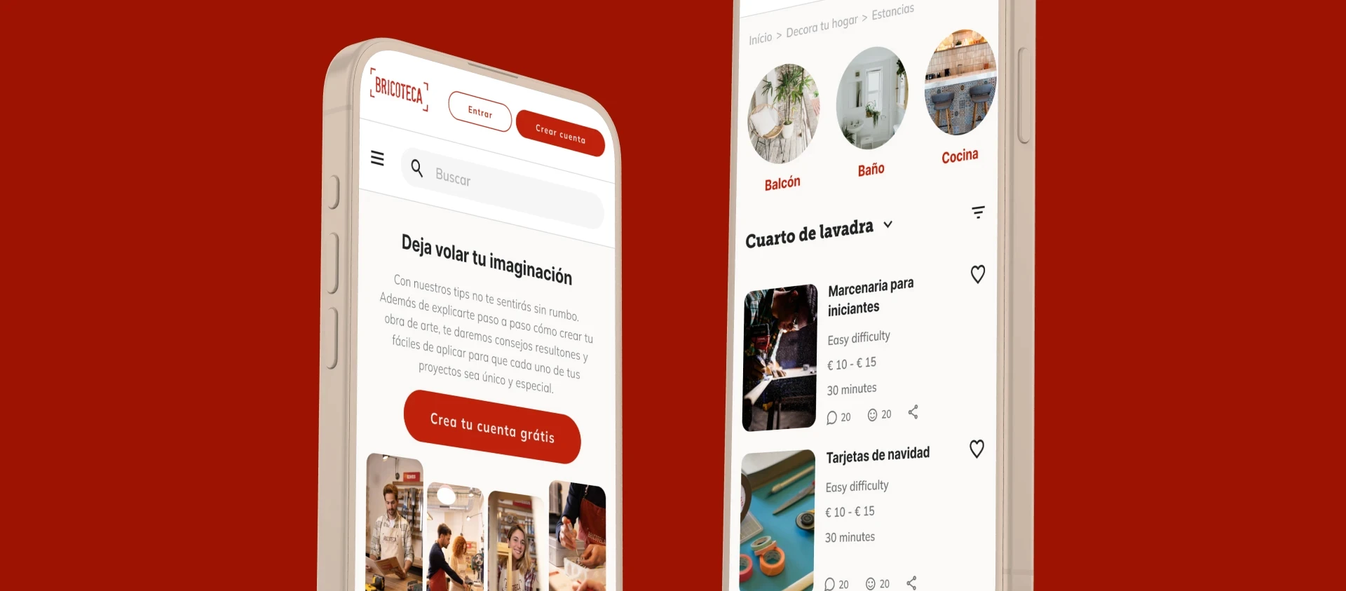
Decision #3: Visual-First Project Cards
Text-heavy project listings don't inspire action. Large hero images with minimal text let users assess project appeal in <1 second, matching how makers actually browse.


Design principles
Design principles that guided our solution
Approachable Expertise
Show Bricoteca knows DIY deeply, but never make users feel inadequate.
Physical-Digital Harmony
Platform should feel like extension of warm, hands-on physical centers.
Contribution Over Consumption
Design constantly encourages sharing, not just browsing.
Progressive Engagement
Reveal advanced features as users demonstrate readiness.
Feature prioritization
Phase 1 (Launch MVP):
✅ Discover feed with personalization
✅ Project pages with documentation
✅ User profiles/portfolios
✅ Workshop directory
✅ Search and filtering
Explicitly Deprioritized (moved to Phase 2):
❌ Direct messaging
❌ Advanced gamification
❌ Marketplace integration
❌ Native mobile app
❌ User uploaded content
Rationale
MVP needed to prove users would: discover and engage with projects; contribute their own content; and return regularly. Everything else deferred until these fundamentals validated.
The solution
Personalized Discovery Feed
User Need: users want inspiration matched to their interests and skill level, not overwhelming everything at once.
Design Approach
Personalized based on interests and skill level
Large, inspiring imagery
Clear skill indicators on every card
Quick save/share actions

Project Detail Pages
User Need: once inspired, users need complete information to actually make it, materials, steps, tips.
Design Approach:
Hero image + skill level + time estimate
Checkable materials list
Step-by-step instructions
Related workshops and tutorials
Community Q&A

Workshop Integration
User Need: connect digital inspiration to hands-on physical learning.
Design Approach:
Browsable workshop catalog
Contextual promotion on project pages
Direct registration
Center-specific filtering
Impact: This integration was Bricoteca's unique competitive advantage, something Pinterest, YouTube, or forums couldn't offer.

Visual brand & design system
Bricoteca's design needed to scale across desktop, tablet, and mobile, and eventually be handed off to an external development team that hadn't been part of the design process. That constraint shaped the entire approach: every visual decision had to be documented, every component had to work in isolation, and every state had to be accounted for before a single line of code was written.
The result was a complete, structured Design System built as a shared Figma library (covering foundations, a three-tier component architecture, and full-page templates) designed to give the development team everything they needed to build without a designer in the room.


Results & impact
Over three months, we designed and validated a comprehensive community platform with stakeholders. Before launch, Henkel's corporate restructuring paused the project, but the strategic framework and design foundation remain valuable for future initiatives.
What we validated
Four key decisions resonated with stakeholders:
Workshop Integration: our physical-digital bridge was seen as Bricoteca's unique competitive advantage.
Skill-Level Organization: systematic approach to skill anxiety addressed real user barriers.
Clear Architecture: information organization praised as superior to existing platforms.
Key learnings
Integration beats fragmentation: users need unified experiences, not separate tools for each task.
Community = Friction removal: making contribution effortless matters more than adding social features.
Physical-digital moats: workshop integration creates competitive advantage digital-natives can't replicate.
What I'd Do Differently
Advocate for lightweight user testing earlier (we relied on competitive analysis and stakeholder knowledge). Start with explicit MVP vs. Phase 2 framing to prevent late-stage scope negotiations.


Key takeaways
Building community platforms isn't about adding social features: it's about designing systems that make contribution feel inevitable. For Bricoteca, the solution wasn't better documentation tools; it was removing documentation as a barrier entirely. Everything else optional.
When designing any system requiring user input, ask: How do we make this so simple it doesn't feel like effort?